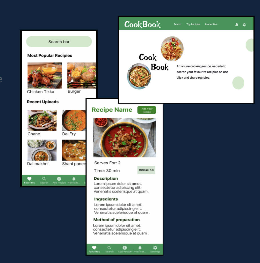
PROJECT OVERVIEW

Duration: August 2022

It is a beginner online recipe checking app for the users who want to cook food and want to share recipes with others.

The problem

Users who don’t know how to cook and want to learn cooking. They need an online platform which helps the users to start their cooking journey.

The goal

To make a beginner friendly application/website that helps the users and professionals with their cooking.

My role

UX designer leading the app and responsive website design from conception to delivery.

Responsibilities

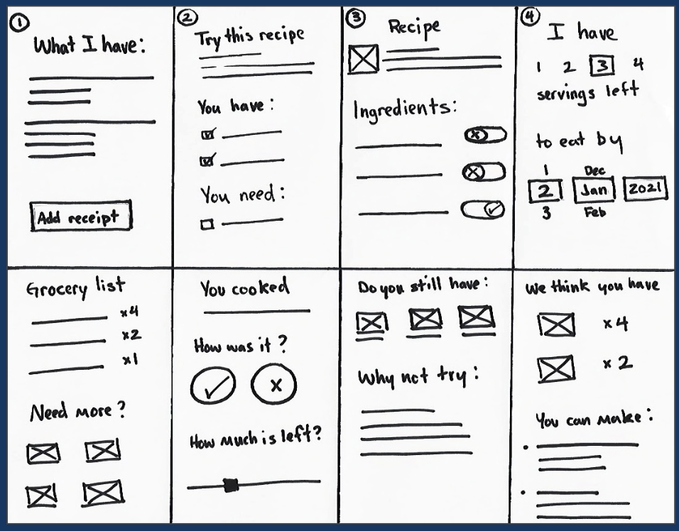
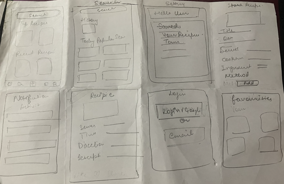
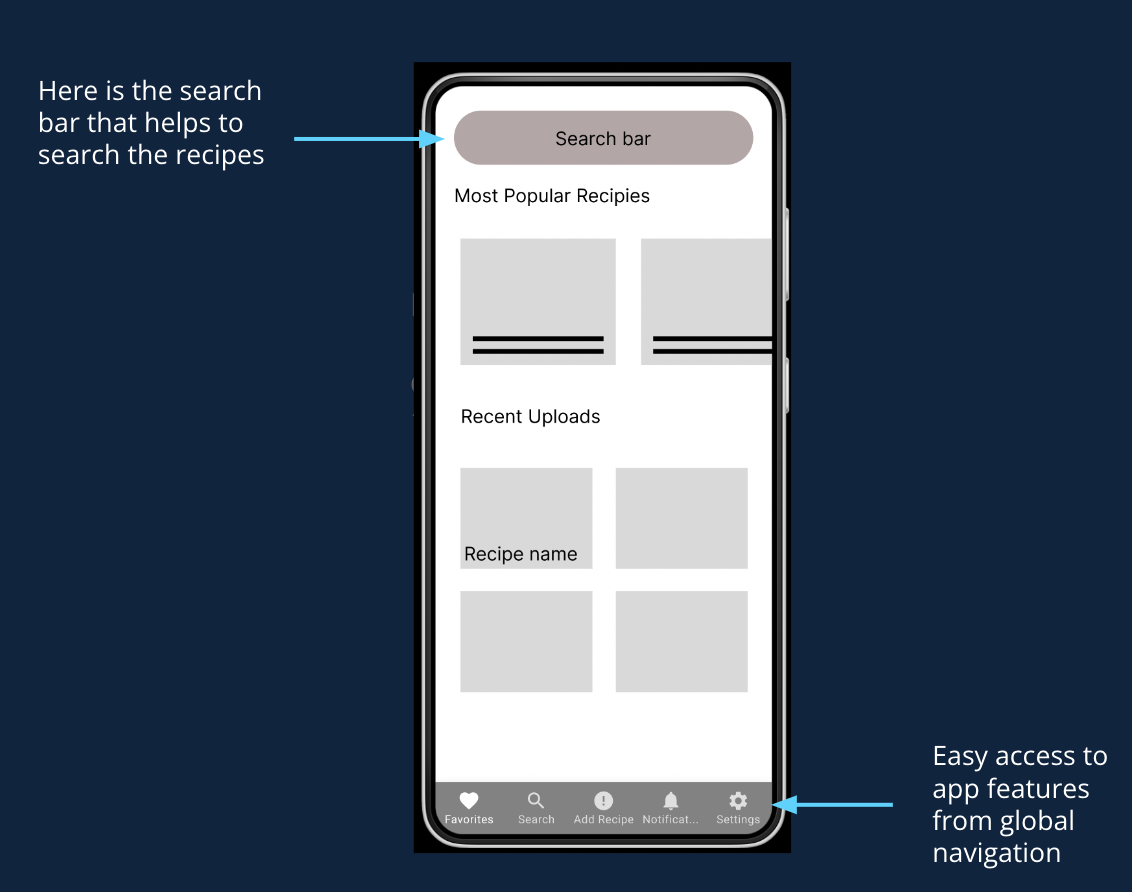
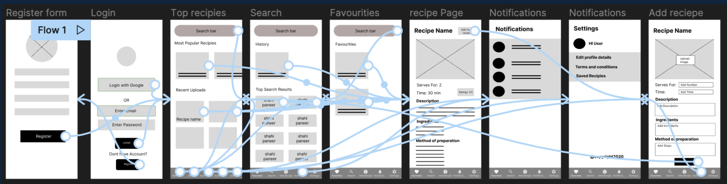
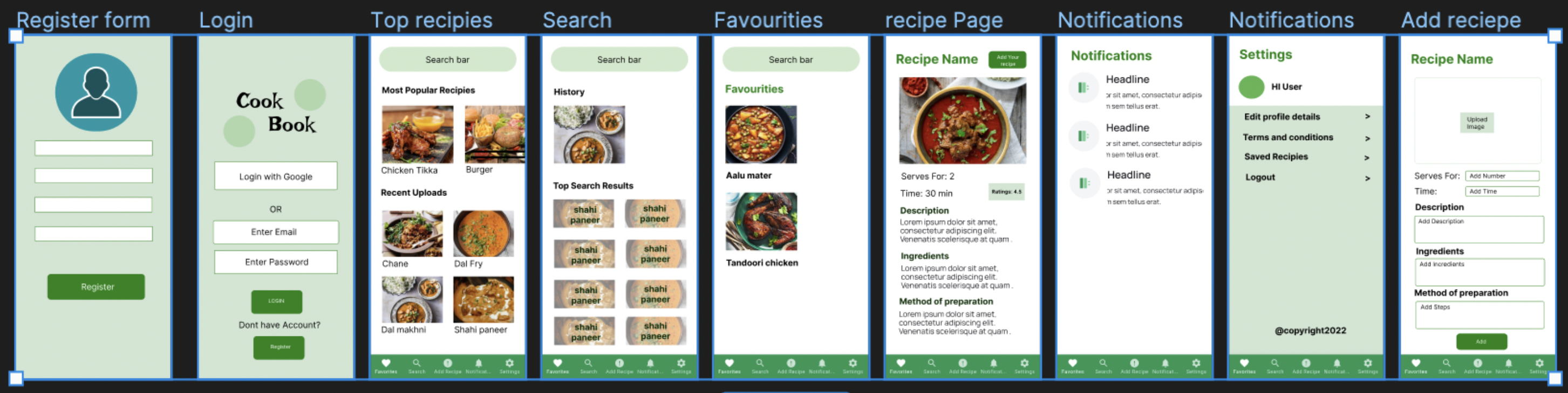
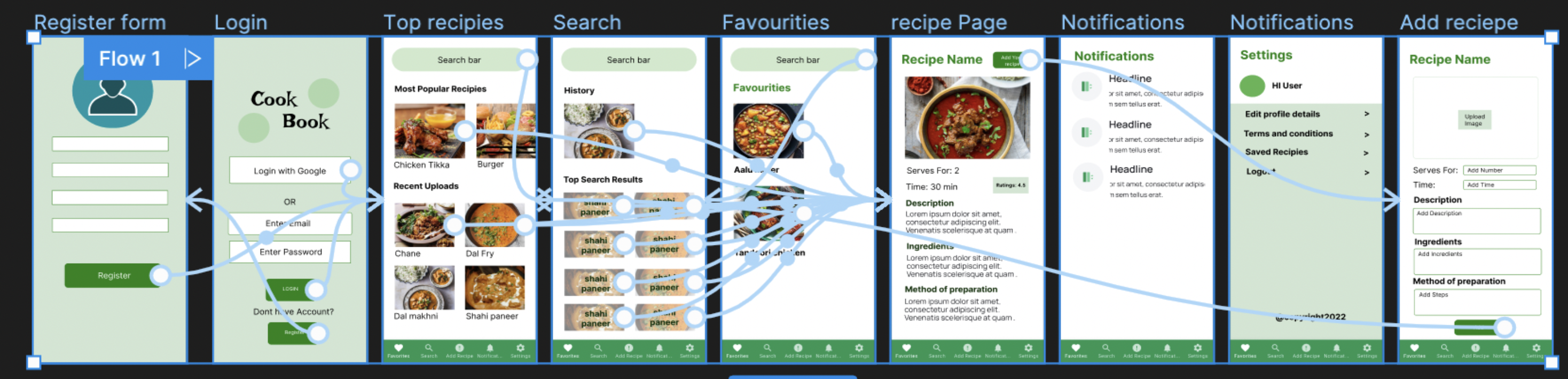
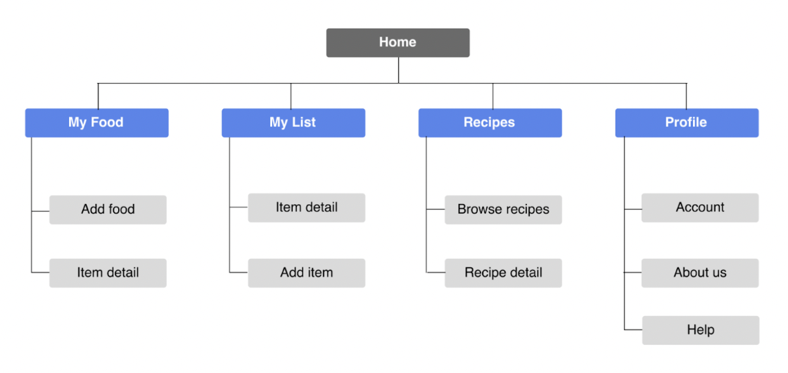
Conducting interviews, paper and digital wireframing, low and high-fidelity prototyping, conducting usability studies, accounting for accessibility, iterating on designs, determining information architecture, and responsive design.

Suitepads mobile site

RESEARCH

SUMMARY

I used cook book’s data on food recipes to develop interview questions, which were then used to conduct user interviews. Most interview participants reported feeling badly about not knowing how to cook, but they want to start their cooking journey.

The feedback received through research made it very clear that users would be open and willing to learn cooking and make delicious food if they had access to an easy-to-use tool to help guide them.

PAIN POINTS
Search

Initially, search was limited to the homepage. In future revisions, search will be integrated into every page.

Favourite Section

Users find it difficult to look for the one recipie every time from the list. So adding a favourites section where user can see their favourite recipe.

New uploads

There was no place from where the users can get new and fresh uploads. We are planning to add recent uplod section.

PERSONAS
CAM

Cam is a working professional who wants an online app that helps her to cook delicious recipes with proper procedures.

Initial sketches
Initial sketches
Thierry

Thierry is a student who needs reminders, suggestions, and coaching to cook more often with fresh ingredients because they like to cook and want to make it a part of their routine.

COMPETITIVE AUDIT

An audit of a few competitor’s products provided direction on gaps and opportunities to address with the Cook Book app.

Initial sketches
IDEATION

I did a quick ideation exercise to come up with ideas for how to address gaps identified in the competitive audit. My focus was specifically on searching interesting recipes and simple features.

Ideation

STARTING THE DESIGN

PAPER WIREFRAMES

Basic outline structure of the app with necessary features required for the app.

Paper Wireframe
DIGITAL WIREFRAMES

The main goal for the design was to keep things clean, simple and organized so the user had a clear path to their goal.

Digital Wireframe
LOW FIDELITY PROTOTYPES

To prepare for usability testing, I created a low-fidelity prototype that connected the user flow of searching, viewing and posting a Recipies.

Low fidelity prototype
USABILITY STUDY PARAMETERS
STUDY TYPE

Unmoderated Usability Study

LOCATION

Remote

PARTICIPANTS

5 participants

LENGTH

15-30 minutes

USABILITY STUDY FINDINGS

I conducted one usability study. The results found that most users had no problems navigating the site, but they did identify some basic pain points that were simple to resolve. With such positive feedback from the first study, a second was deemed unnecessary.

Recipes

Users want easy access to recipes that specifically use the food they already own.

Favorites

Users want to save the recipes so that they can use them in future while cooking.

Sharing their own recipes

Users want to share their recipies as well to help the others.

REFINING THE DESIGN

MOCKUPS

Based on the insights from the usability studies, I applied design changes like providing a clear section from the home screen to browse recipes through search.

Mockups

Based on the insights i have designed a section where who who want to share their recipes can upload their recipe.

Mockups

Mockup designs for the whole website

Mockups
HIGH FIDELITY PROTOTYPES

The pages were converted to high-fidelity prototypes and typography, images and colors were added to bring the site closer to its final version.

Hi Fidelity Prototypes
SITEMAP

With the app designs completed, I started work on designing the responsive website. I used the Cook Book sitemap to guide the organizational structure of each screen’s design to ensure a cohesive and consistent experience across devices.

Sitemap
Responsive Design

The designs for screen size variation included mobile, tablet, and desktop. I optimized the designs to fit specific user needs of each device and screen size.

Hi Fidelity Prototypes

CONCLUSION

IMPACT

Users shared that the app made seem like something they could actually help to cook food . One quote from peer feedback was that “the Cook Book app helps bring caring about the users to a personal level in a way that’s easy and engaging.”

WHAT I LEARNED

I learned that even though the problem I was trying to solve was a big one, diligently going through each step of the design process and aligning with specific user needs helped me come up with solutions that were both feasible and useful.

NEXT STEPS

1. Refine color scheme, typography and layout.

2. Conduct research on how successful the app is in reaching the goal to explore more recipes.

3. Add option of like, comment on recipes and share recipes.

THANKS FOR LOOKING!

I hope you enjoyed reviewing this case study of CookBook