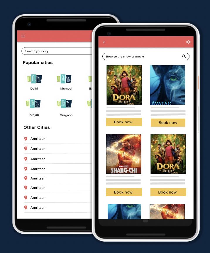
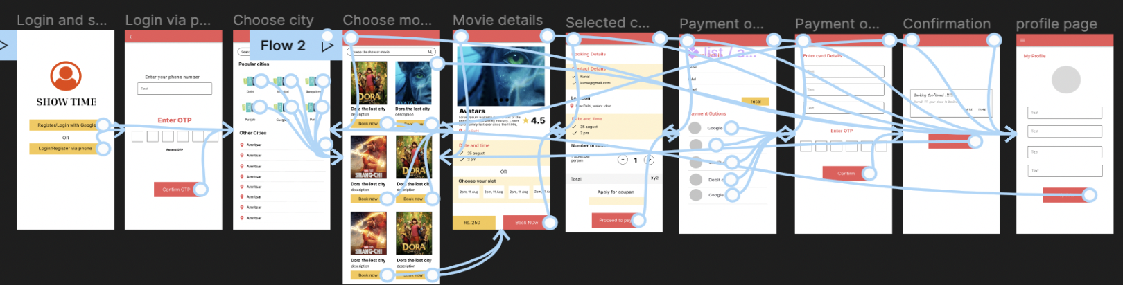
PROJECT OVERVIEW

Duration: August 2022

We’re creating an online movie ticket booking app to attract and retain customers in our online system. We noticed that our competitors offer dedicated mobile apps for their customers to book various shows and movies with advance features but we want to create a product that can compete in the market, improve sales, and increase customer satisfaction.

The problem

People who don’t want to wait in the long queues for movie ticket booking.

The goal

To build an online movie ticket booking app for users who want to book tickets online without standing in long queues.

My role

UX designer designing online ticket booking app.

Responsibilities

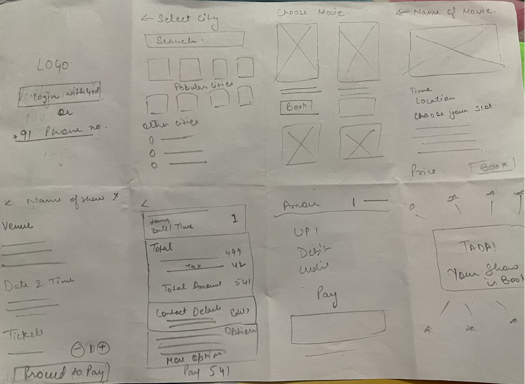
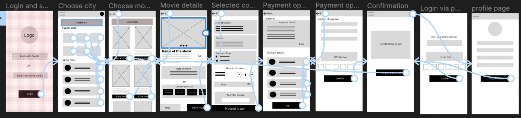
Conducting interviews, paper and digital wireframing, low and high-fidelity prototyping, conducting usability studies, accounting for accessibility, and iterating on designs.

Suitepads mobile site

RESEARCH

SUMMARY

I conducted interviews and created empathy maps to understand the users I’m designing for and their needs. A primary user group identified through research was working adults who don’t have time to stand in long waiting queues for ticket booking.

This user group confirmed initial assumptions about movie booking customers, but research also revealed that time was not the only factor limiting users. Other user problems included obligations, interests, or challenges that make it difficult to get shows booked for watching movie and shows.

PAIN POINTS
Time

Working adults are too busy to spend time in long lines for booking tickets.

Accessibility

Platforms for booking movie tickets that are not equipped with assistive technologies.

IA

Too much features usually confuses users to focus on the main task.

PERSONAS
Liza

Liza is a working professional who needs to book online tickets Because she don’t have time to stand in long queues.

Initial sketches
JOURNEY MAP

Mapping Liza’s user journey revealed how helpful it would be for users to have access to a dedicated movie ticket booking app.

Initial sketches

STARTING THE DESIGN

PAPER WIREFRAMES

Taking the time to draft iterations of each screen of the app on paper ensured that the elements that made it to digital wireframes would be well-suited to address user pain points. For the home screen, I prioritized a quick and easy booking process to help users save time.

Paper Wireframe
DIGITAL WIREFRAMES

Search your city or choose the city from list where you want to watch a movie

Digital Wireframe

Details of the movie with location, date and time. User can also choose the time and date slot as per her/his convenience.

Digital Wireframe

A confirmation message in order to confirm the user about their booking.

Digital Wireframe
LOW FIDELITY PROTOTYPES

Using the completed set of digital wireframes, I created a low-fidelity prototype. The primary user flow I connected was booking an online ticket, so the prototype could be used in a usability study.

Low fidelity prototype
USABILITY STUDY PARAMETERS
STUDY TYPE

Unmoderated Usability Study

LOCATION

Remote

PARTICIPANTS

5 participants

LENGTH

15-30 minutes

USABILITY STUDY FINDINGS

Write a short introduction to the usability studies you conducted and your findings.

Round 1

No search feature.

No OTP login via phone.

Round 2

Extra pay button on checkout.

User edit profile page.

REFINING THE DESIGN

MOCKUPS

The first usability study revealed frustration with no search option. to streamline this flow, I added the search option for users to search the shows they want.

Mockups

The second usability study revealed frustration with payment flow. To streamline this flow, I consolidated the “Pay button” was extra so i removed that.

Mockups

Mockup designs for the whole website

Mockups

Mockup designs for the whole website

Mockups
HIGH FIDELITY PROTOTYPES

The final high-fidelity prototype presented cleaner user flows for booking a show and checkout. It also met user needs for online booking.

Hi Fidelity Prototypes
ACCESSIBILITY CONCERNS

Provided access to users who are vision impaired through adding alt text to images for screen readers.

Used icons to help make navigation easier.

Used detailed imagery for shows and movies to help all users better understand the designs.

CONCLUSION

IMPACT

The app makes users feel like Show time really thinks about how to meet their needs. One quote from peer feedback: “The app made it so easy and fun to book my show online. I would definitely use this app as a go-to for a quick show booking.” ”

WHAT I LEARNED

While designing the Show Time app, I learned that the first ideas for the app are only the beginning of the process. Usability studies and peer feedback influenced each iteration of the app’s designs.

NEXT STEPS

1. Conduct another round of usability studies to validate whether the pain points users experienced have been effectively addressed.

2. Conduct more user research to determine any new areas of need.

THANKS FOR LOOKING!

Thank you for your time reviewing my work on the Show Time app!